Showing posts with label INDEX. Show all posts

Saturday, August 16, 2014

"Soros Put" Rises To Record: Is The Billionaire Investor Betting On Market Crash?

Back in February we observed, with some surprise, when Soros Fund Management, the investment vehicle of the famous Hungarian billionaire investor revealed in its Q4 13F that the firm had taken its bearish S&P 500 ETF - aka SPY - put exposure to a then record $1.3 billion notional, prompting us and many others to ask if Soros was preparing for a market crash. Fast forward to today when following the latest 13F disclosure from the same fund, we note, with double the surprise that a quarter after the same ETF put was lowered to "only" $299 million notional, Soros has once again increased his total SPY Put to a new record high of $2.2 billion, or nearly double the previous all time high, and a whopping 17% of his total AUM.
"Soros Put" Rises To Record: Is The Billionaire Investor Betting On Market Crash?
Some observations, which we presented previously: the "Soros put" is a legacy hedge position that the 84-year old has been rolling over every quarter since 2010. Since this was an increase of 638% Q/Q this has some people concerned that the author of 'reflexivity' and the founder of "open societies" may be anticipating some major market downside.
Furthermore, remember that what was disclosed yesterday is a snapshot of Soros' holdings as of 45 days ago. What he may or may not have done with his hedge since then is largely unknown, and since there are no investor letters, there is no way of knowing even on a leaked basis how the billionaire has since positioned for the market.
Then again, considering that not only Yellen, who has warned about bubble pockets in stocks, but the BIS, Icahn and numerous other fund managers, now openly warn that the entire market has entered bubble territory, perhaps this is a case where the simplest explanation is also the right one...

Sourced from ZeroHedge

Thursday, August 14, 2014

BofAML Warns "Start Looking For An S&P Top"

"It's time to start look for a top in the S&P500," are the cautious words that BofAML's Macneil Curry begins his latest note, adding that this corrections will pressure 10Y yields to new cycle lows.

Via BofAML,
Start looking for an S&P500 top.
Its time to start look for a top in the S&P500. Into 1952/56, worst case 1958/68 we look for a top and resumption of the larger downtrend towards 1887/1865 (14m channel and 200d avg).
10yr yields at risk of resuming their larger downtrend. 
This should put significant pressure on US 10yr Treasury yields to resume their larger bull trend for 2.33%/2.29% (retracement and 6m channel support).
*  *  *
A break of 1928 in the S&P500 says the downtrend has resumed, while Treasury bulls need a close 2.4109%/2.406% to say that the correction is over.  

Wednesday, August 6, 2014

DeMark Says "Sell China, The Trend Is About To End"

We noted last week the coincidental surge in China's currency and stock market (bettering US equities for 2014) after they quietly unveiled QE-lite, but, as Bloomberg reportsTom DeMark says "selling into strength is now recommended," with losses expected over the next six months. This follows his prediction from June that China's Shanghai Composite was due for a recovery, presaging a 16% rise. With last night's hint of China's credit impulse fading and CNY now recoupled with its fixing, perhaps he is right that the short-term catalysts for gains are exhausted. As DeMark concludes, "the trend is your friend until the trend is about to end."

A reminder of the driver of China's recent strength...
DeMark Says "Sell China, The Trend Is About To End"

The Shanghai Composite Index will probably end its world-beating rally within days and fall about 10 percent, said Tom DeMark, the developer of market-timing indicators who predicted the gauge’s peak last year.

...poised to erase those gains and drop below this year’s intraday low of 1,974.38.

DeMark Says "Sell China, The Trend Is About To End"


“Selling into strength now is recommended,” wrote DeMark, the founder of DeMark Analytics LLC in Scottsdale, Arizona, who has spent more than 40 years developing indicators to identify market turning points. “The trend is your friend until the trend is about to end.”
DeMark has had a good year in China...
DeMark’s prediction in February 2013 that the Shanghai Composite would retreat came a day before the index began an almost 20 percent tumble from a nine-month high of 2,434.48.

His prediction on June 21, 2013 that the stock gauge was poised for a recovery presaged a 16 percent advance from its closing low on June 27 through mid-September.
“It is always best to announce a top/bottom before it might occur so one is able to sell strength or buy weakness,” DeMark wrote.
*  *  *
Perhaps the market senses the hangover from China's huge credit impulse is coming...
DeMark Says "Sell China, The Trend Is About To End"

Saturday, August 2, 2014

The Best And Worst Performing Assets In July 2014 And YTD

Up until the last day of July, everything was going great: stocks were solidly up for the month, the DJIA was on the verge of 17,000, and the wealth effect was flourishing, if not the economy. Then yesterday happened, and everything changed: not only did the S&P turn red for the month, but the DJIA slid to red for 2014. So what is the best performing asset class in July? With the PBOC now openly unleashing QE in its economy, no surprise that it was the Shanghai Composite, which returned over 8%, if virtually nothing since 2009. However, don't expect this to last: for China real estate is orders of magnitude more important than the stock market to boost the wealth effect.
As for the best returning assets class in 2014 YTD: don't laugh - it's still Spain and Italy. Expect the day of reckoning for Europe's periphery to be fast, unexpected and very brutal.
From Deutsche Bank:
The last 48 hours have made a big difference to returns in July with a sell-off in rates, credit, equities and commodities changing the month dramatically over this period and leaving a few more markets down for 2014 now.

DM equities were tipped into negative territory for July while EM stocks had enough outperformance through the rest of the month to largely stay in positive territory despite the weakness in Russian equity markets. China was the key outperformer with the Shanghai Composite (+8.8%) posting its best monthly total return performance since December 2012. The rally in China also benefitted Hong Kong equities with the Hang Seng (+7.3%) recording its biggest monthly gain in two and a half years. Back to the DM world, the Stoxx 600 and S&P 500 were -1.6% and -1.4% respectively – with the former probably negative impacted by the BES-driven weakness in Portugal (-10.5%).

A poor month for the DAX (-4.3%) and CAC (-4.0%) has pushed them both into negative total return territory for the year at -1.5% and -1.2%, respectively. The FTSE was down -0.1% on the month keeping it in slightly negative territory for the year (-0.3%) although dividends have helped YTD total returns stay in the green. The DOW is also down YTD now.

Moving on to Fixed Income, it was a mixed month for core rates with Europe outperforming Treasuries. This is perhaps not surprising with core European rates flirting around their all time lows whilst USTs suffered a dip following the strong GDP print just a day before month end thus giving up about half of all of the month's earlier strong gains. Turning to Credit, it was modest month for IG total returns but nevertheless IG still did better than HY with US HY (-1.7%) underperforming on the ETF outflow story. Staying in fixed income but moving to EM, the overall benchmark was down 0.6% with strength in Asia (+1.3%) neutralising the weakness in Latam (-0.7%) and EEMEA (-1.3%).

The commodity complex had a very weak month with Corn, Wheat, and Brent all down -16%, -6%, and -5% respectively. Incidentally this also came during a fairly encouraging month for the Dollar bulls with the Greenback appreciating about 2% against a basket of major currencies.

To sum up the year to date performance so far, the European peripheral complex is still the key winner with the IBEX (+12%), FTSEMIB (+11%), Spanish Bonds (+10%) and BTPs (+10%) topping our performance ranking chart and returning about twice as much as the S&P 500 (+6%). EM equities have also done surprisingly well this year with a +8% gain to date. The latest July performance in China has also bumped both the Shanghai Composite (+7%) and the Hang Seng (+9%) into our top 10 list. Core DM rates are still in positive territory, though not surprisingly with Bunds (+6%) outpacing Treasuries (+3%). On the other end of the spectrum, the Nikkei (-3%) remains a key laggard while Russia (-5%) is feeling the heat from the ongoing geopolitical volatility. Generally commodities are amongst the worst performers this year largely led by softs.
Visually, the month of July
The Best And Worst Performing Assets In July 2014 And YTD

And YTD:
The Best And Worst Performing Assets In July 2014 And YTD

Tuesday, July 22, 2014

The New Scariest Chart In America

For the last few years, the 'scariest' chart for Europeans has been the unending surge in youth unemployment. However, amid all the sound and fury of mainstream US media discussions of the 'recovery' in America and the President's employment track record, Constantin Gurdgiev notes another 'scariest chart of the US recovery' that remains in full 'crisis mode'...

The Duration of Unemployment In The US...
The New Scariest Chart In America

Monday, July 21, 2014

Money Printing Is Not Bringing Prosperity To Main Street In 3 Charts

Furious money printing by the world’s major central banks is not generating real growth and prosperity—–but professional economists never seem to get the word. As shown below, the 2014 outlook for global real growth has been marked down sharply since early 2013. Back then, of course, Abenomics and massive QE by the BOJ was supposed to cause the Japanese economy to soar; Draghi’s “anything it takes” bromide was going to jolt Europe out of its slump; and the elixir of QE3 was certain to finally cause the US economy to attain “escape velocity”.
Its not working out that way. In Japan, import inflation is soaring, real wages are still falling and the economy is entering a new slump in Q2 owing to a tax increase that was unavoidably necessary to pay for its runaway fiscal largesse. In Europe, the Bank Of Italy, Draghi’s home base, has now marked its forecast of 2014 real GDP growth to essentially zero. And in the US after the disastrous first quarter, along with what is shaping up to be a tepid second quarter, real growth will not achieve any kind of velocity, “escape” or otherwise; in fact, consensus real GDP has already been marked down to 1.7%—the lowest rate of expansion since the financial crisis. Accordingly, it is only a matter of time before the global forecast for 2014 shown below below is marked down even further.

Money Printing Is Not Bringing Prosperity To Main Street In 3 Charts

It is no mystery as to where all the central bank “stimulus” is going. Since early 2013 fully fourth-fifths of the 40% rise in the S&P 500 is due to multiple expansion, not earnings growth from a tepid economy. This is clearly the effect of massive central bank injections of cash into Wall Street and other financial markets, yet it is especially perverse under current circumstances. Given the massive instabilities and headwinds afflicting the global economy—from the house of cards in China, to the failing retirement colony in Japan, the welfare state fiscal crunch in Europe and the faltering growth of breadwinner jobs and real investment in productive assets in the US—-the capitalization rate of future earnings should be down-rated. That is, future corporate earnings are now worth far less than the historical PE norm, not more. Accordingly, the massive expansion of PEs shown below is yet another expression of the vast financial deformations being caused by monetary central planning.

Money Printing Is Not Bringing Prosperity To Main Street In 3 Charts
In any event, the “financialization” brought on by the central banks has had a truly perverse effect.Stock markets and corporate profits are at all time highs. Yet the true measure of main street economic health—-the share of adults who are employed—is at a modern low. It is said by traditionalist believers in sound money that we can not print our way to prosperity.
Money Printing Is Not Bringing Prosperity To Main Street In 3 Charts

These charts of the week provide some pretty stunning evidence of that truth.

The 2 Charts That Have BofA Worried About A "Greater Correction" In Stocks

While the S&P500 rebounded sharply on Friday, BofAML's Macneil Curry warns evidence continues to say that this is a very late stage advance from which a greater correction is forthcoming. The recent deterioration in breadth (52wk highs failing to keep track with price), the negative seasonal period and divergences between the broader indexes say that risk/reward is skewing to the downside. Bottom Line: "The S&P 500 is vulnerable."

Via BofAML's Macneil Curry,
The S&P500 is vulnerable
While the trend in the S&P500 is still higher, with potential for a near term push towards 2000; this is a very late stage advance from which we look for a medium term correction. 1944 (the June-26 low) is key. Below here confirms a top and turn...
The 2 Charts That Have BofA Worried About A "Greater Correction" In Stocks

The 2 charts he is most concerned about...
Breadth...
The 2 Charts That Have BofA Worried About A "Greater Correction" In Stocks

The bearish divergence for new 52-week highs from last May points to fewer and fewer new 52-week highs as the S&P 500 has continued to rally to new all-time highs. This suggests weaker internals.
The divergence in new 52-week highs from last May is a sign of a maturing rally from late 2012.

and Seasonals... 
The 2 Charts That Have BofA Worried About A "Greater Correction" In Stocks

With President Obama in his second
term, 2014 is an incumbent mid-term.2014 is following the incumbent midterm year YTD through June. The pattern calls for a June/July peak ahead of a pullback into September. This has the potential to support large and mega caps relative to small caps.
The 2 Charts That Have BofA Worried About A "Greater Correction" In Stocks

Going back to 1928, July is the strongest month of the year with an average return of 1.52% and is up 57% of the time.
However, June was up 1.9% and July returns tend to fizzle, not sizzle, after an up June. When the month of June is up, July is up only 51% of the time and has an average return of 0.48%. This is well below average for July and a below the average monthly return for all months of 0.59%.

Sunday, July 13, 2014

A Significant Decline is Coming to The Stock Market

Last week we wrote that a trend turn is coming to stocks. Stocks immediately declined sharply. However, we believe there is a much larger decline coming and that it could start soon. Didn't it already start this past week? Maybe, maybe not. This past week's decline has several "corrective" characteristics that suggest it is not the big decline we expect to start. There could be more upside before that large sell-off begins. What we can ascertain this weekend is that a significant decline is not far away. If it started last week, a much deeper decline is on its way. If it did not start last week, it could start very soon. Here is some of the evidence why we believe a significant decline should be underway within a few weeks:
S&P500 versus Demand Power and Supply
Above we see that there is a Bearish Divergence between the S&P 500 and Demand Power. The Divergence is maturing, suggesting a top is close at hand and a significant decline should begin soon.
NASDAQ100 versus Demand Power and Supply
Above we see that there is a Bearish Divergence between the NASDAQ 100 and its Demand Power Measure. The Divergence s maturing, suggesting a top is close at hand and a significant decline should begin soon.
NYSE 10-Day Moving Average Advance/Decline Line versus S&P500
Above we see that there is a Bearish Divergence between the S&P 500 and the NYSE 10 Day Average Advance/Decline Line Indicator. The Divergence is maturing, suggesting a top is close at hand and a significant decline should begin soon.
NASDAQ100 10-Day Moving Average versus Advance/Decline Line versus NASDAQ100
RUT 10-Day Moving Average Advance/Decline Line versus Ressell 2000
Above, we see similar Bearish Divergences with their 10 Day Average Advance/Decline Line Indicators and prices for the small cap Russell 2000 and also the NASDAQ 100. These divergences are maturing, suggesting a top in stocks should arrive over the next two weeks, with the start of a strong decline.

Robert McHugh

Thursday, July 10, 2014

Gold Spikes, Bonds & Stocks Surge Despite Fed Warning Over Complacency

As usual the initial knee-jerk reaction (in this case lower in stock prices and higher in bond yields) has been faded rapidly and despite Fed warnings over investor complacency (and real economic uncertainty not being priced in), investors are buying bonds and stocks with both hands and feet (for now)... Gold is spiking higher as the USD drops.
Gold is spiking
Gold Spikes, Bonds & Stocks Surge Despite Fed Warning Over Complacency

As Bonds, stocks, and the USD revert
Gold Spikes, Bonds & Stocks Surge Despite Fed Warning Over Complacency

How long can this last?
Gold Spikes, Bonds & Stocks Surge Despite Fed Warning Over Complacency

Charts: Bloomberg

Tuesday, July 8, 2014

Dow Loses 17,000; Catches Down To Bonds

We warned Thursday that there was something wrong with the picture of the equity market's exuberance but it seems the July-4th-week-effect has run its course and equity markets - having read the jobs report over the weekend - have realized it is anything but strong. The Dow just lost 17,000 (however briefly) and equities are catching down to Treasury yield's drop as USDJPY loses 102.00.

Dow loses 17k...
Dow Loses 17,000; Catches Down To Bonds

as Stocks catch down to bonds...
Dow Loses 17,000; Catches Down To Bonds

Charts: Bloomberg

Sunday, July 6, 2014

McClellan Sounds "Alarm" Over Stock Market Drawdowns


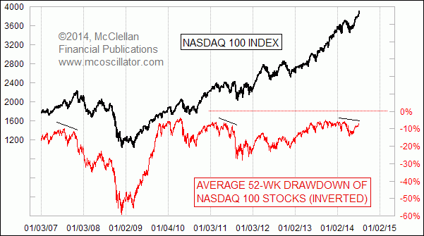
Alarming Sign in NDX Stocks’ Drawdown

Chart In Focus
July 03, 2014
The Nasdaq 100 Index is making new multi-year highs, levels not seen since the weeks just after the 2000 Internet Bubble top.  But it is interesting for us to see that the average component stock in that index is down 7% from its trailing 52-week high. 
And that 7% drawdown number is actually smaller than it has been recently, but it is still not back to the low drawdown reading of 6.0% that we saw in early March, before the Nasdaq 100 stocks got into a patch of trouble.  And the fascinating point is that divergences like this tend to be really important for the long-run picture for stock prices.
This current divergence is not guaranteed to stay with us.  It looks like a genuine divergence now, but it is still possible that we could see a continued rally that takes the stocks in the Nasdaq 100 collectively up closer to the level of their 52-week closing highs, thereby closing the gap on this measure of average drawdown.  But for now, the message is that the average stock making up the Nasdaq 100 Index is not confirming the bullish message of the NDX’s higher price highs. 
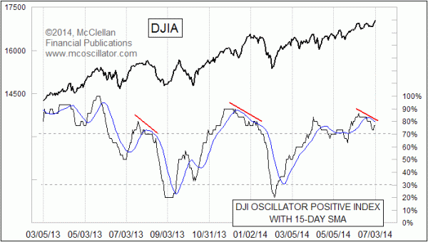
A similar message comes from a similar indicator, this time examining the 30 stocks which make up the DJIA. 
DJI Oscillator Positive Index
This one looks at the 30 stocks that make up the DJIA, and checks each one to see if its Price Oscillator is above or below zero.  What we are seeing lately is a declining number of Dow components participating in the uptrend that way, and a drop of this indicator below its 15-day moving average.  This condition also comes as a divergence appears between prices and the indicator.
As with the NDX stocks’ indicator above, the divergence does not absolutely have to persist; the market could just power through it, but that is not usually the way things usually work out.
Via Tom McClellan via NTMarkets

Friday, July 4, 2014

What's Wrong With This Picture?

It seems the bond market 'read' the report and the stock market skimmed the headlines...What's Wrong With This Picture?

What Happened The Last 4 Times Stocks Rallied For 23 Quarters?

The S&P 500 is in the 23rd quarter of its recovery - and shows a 196% gain.... the last four moves of similar magnitude ended very badly.What Happened The Last 4 Times Stocks Rallied For 23 Quarters?

Friday, June 27, 2014

Stocks Slump As Fed's Bullard Warns The Market Is Wrong

 "Markets don't appreciate how close the Fed is to its goals," and thus tightening is the warning from the usually quite dovish Jim Bullard.
  • BULLARD SAYS MARKETS DON'T APPRECIATE HOW CLOSE FED IS TO GOALS
  • BULLARD SAYS HE'S TRYING TO PUT EMPHASIS ON CLOSENESS TO GOALS
  • BULLARD: MARKETS SHOULD BE PRICING IN RATE INCREASES BASED ON WHAT THE FED SAYS
  •  BULLARD: ECONOMY SHOULD BE ABLE TO HANDLE IT IF WE BEGIN TO PULL BACK FROM WHERE MONETARY POLICY IS NOW
Remember, don't fight the fed - unless they say sell?

Stocks Slump As Fed's Bullard Warns The Market Is Wrong

And it seems the market that is 'wrong' is stocks; as bond yields continue to tumble to 4-week lows. Consider for a moment the many reasons why bonds would be here and now thanks to Bullard, they are front-running the equity sell-off (knowing that once stocks dump, it will all go into duration).

Thursday, June 26, 2014

Citi Warns US Equities Are Facing A Pullback

US equity indices are showing signs that a pullback may be developing, Citi's FX Technicals group notes, as the S&P 500 Index, the NASDAQ Composite Index and the Dow Industrials Index all posted bearish key days yesterday. A short-term correction on the order of 3%-6% may be developing on the back of this.
The Dow Transports Index, which has been the leading US equity Index this year, has already been showing signs of stress as well. The VIX Index is also turning higher from low levels and should head up towards at least 14% if not 18% if the pullback in equities materializes.

Citi Warns US Equities Are Facing A Pullback

The US S&P 500 Index posted a bearish key day at the trend highs yesterday. (The last bearish key day at trend highs back in April was followed by a high to low move of -4.4%.) Daily momentum also turned lower and negative momentum divergence has developed (though not triple divergence).
A short-term pullback towards supports around 1920-1925, the converging channel bottom and recent low, appears likely at this point. A break below there then opens the way to good supports around 1900, which would result in a high to low correction of around 4%.
At this point our bias is that a short-term pullback to the above supports would not be out of line within the overall trend higher (markets don’t move in straight lines after all). However, a deeper correction, which is not yet our base case, could see a pullback towards the 1814-1820 area (converging April low and 200 day moving average, which has not been tested since 2012).
Other equity markets are also showing signs of stress.

Tuesday, June 24, 2014

Guess Who Is Propping Up The US Housing Market

A month ago we showed a chart that, in our humble opinion, summarized all that is wrong with the US housing market. The chart in question showed the April breakdown of existing home sales on a Y/Y basis by pricing bucket.
Guess Who Is Propping Up The US Housing Market

Needless to say, what the chart showed was the symptomatic, and schizophrenic, breakdown of US housing into two camps: the housing market for the 1%, those costing $750K and above, where the bulk of transactions are mostly between non-first time buyers, and typically take place as all cash transactions, and the market for "everyone else" which continues to deteriorate.
Moments ago the NAR released its May data, which on first blush was widely lauded as bullish: the topline print came at a 4.9% increase, rising from 4.65MM to 4.89MM, above the 4.74MM expected. Great news... if only on the surface. So what happens when one drills down into the detail? As usual, we focused on the last slide of the NAR breakdown, located at the very end of the supplementary pdf for good reason, because what it shows is hardly as bullish.
So how does this "housing recovery" in which the NAR has proclaimed the "sales decline is over" look on a granular basis.
The answer is below, and it is even worse than the April data. It also explains why first time buyers have dropped to even further cycle lows of just 27%, down from 29% both a month and year ago.
Guess Who Is Propping Up The US Housing Market
This is bad because while in April there was a modest increase sales in house buckets from $250 all the way up to $1MM +, in May the only bucket that had an increase in sales from a year ago was that exclusively reserve for the ultra-richest, i.e., those who benefit the most from the Fed's non-trickle downing wealth effect policies. In fact, on a price bucket basis, the May data was unformly worse than April!
The logical follow up question: what is the total percentage of sales by given price bucket? The answer, once again, below.
Guess Who Is Propping Up The US Housing Market
Housing recovery? Maybe for the richest, and even they are far less exuberant about purchasing $1MM+ mansions. For everyone else, enjoy "plunging" hedonically-adjusted LCD TV prices. Everything else is, well,noise.


Source: NAR

Sunday, June 22, 2014

It's Never Different This Time - 1987 or 2014?

While the price analogs of the last few year's exuberance in US equity markets are enough to worry all but the most systemically bullish "believer"; we suspect the following article from the LA Times In the Spring of 1987 will raise a few hairs on the back of the neck of perpetually optimistic extrapolator..

It's never different this time..
"One of the largest bullish factors is burgeoning worldwide liquidity, thanks to expansive monetary policies by central banks. That has helped fuel a surge of foreign investing that could propel US stocks higher, regardless of what happens to the American economy, some analysts say...

Low interest rates also help stocks by making Treasury securities, certificates of deposit and other interest-paying investments less attractive. The sluggish economy, meanwhile, keeps the Federal Reserve from driving up interest rates and prevents inflation from overheating...

Also, the sluggish economy--by keeping manufacturing rates low--discourages money from flowing out of financial assets into such investments as factories and machinery."
     - LA Times, March 8, 1987; a few months before the October 1987 crash
Read that again!!
Never different.

It's Never Different This Time - 1987 or 2014?

Thursday, June 12, 2014

Global Death Cross Accelerates As World Bank Slashes Growth

The World Bank joined the hallowed ranks of the IMF and admitted it was clueless last night, slashing growth estimates for every developed and developing nation from Brazil to the US. The "bumpy start" as they called it merely exacerbated what is now becoming a dismal joke as the death cross of GDP growth expectations and world stock market valuations diverge in an ever more fragile manner.

Global Death Cross Accelerates As World Bank Slashes Growth


Global Death Cross Accelerates As World Bank Slashes Growth

Friday, June 6, 2014

SocGen 10-Year Outlook: 100% Chance Of Recession; S&P To 4,000 Or 500

No matter what, SocGen sees US equity performance over the next 10 years as modest at best.They note that US equities face three headwinds: cyclically-adjusted valuations (CAPE, starting date 1881) have returned to very expensive territory, corporate margins stand at historically high levels, and after already five years of growth from the 2009 trough, we estimate that the probability of another recession kicking in is close to 100% within the forecast timeframe (the longest cycle ever was 120 months, or 10 years). While their central case is 'moderate growth and inflation', they project a possible high growth surge to 4000 for the S&P 500 and a deflation scenario which would put the S&P 500 at 500 (-12% per annum).

Via SocGen,
This is the second edition of our 10-year equity outlook. The first was published in July 2009, when the economic consensus was still weighing up deflation fears and valuations were depressed (read: an excellent entry point.). At the time we set an S&P500 target of 1300 under our central scenario (in mid-June 2009 it was 923).
[ZH: So in 2009 they forecast the S&P to be at 1300 in 2019... and we are now 50% higher than that already!!]
US equities
US equities face three headwinds:
cyclically-adjusted valuations (CAPE, starting date 1881) have returned to very expensive territory,

corporate margins stand at historically high levels, and

after already five years of growth from the 2009 trough, we estimate that the probability of another recession kicking in is close to 100% within the forecast timeframe (the longest cycle ever was 120 months, or 10 years).

A recession costs on average a 22% drop in US earnings
The most recent economic recession triggered by the collapse of Lehman Brothers caused an unprecedented wave of US earnings downgrades and was comparable in effect to the two previous oil shocks, the Gulf war and the Dot-Com bubble burst.

SocGen 10-Year Outlook: 100% Chance Of Recession; S&P To 4,000 Or 500
But US equities have supports as well, such as impressively strong balance sheets and the beginning of a new M&A cycle, backed by a highly reactive central bank.
SocGen 10-Year Outlook: 100% Chance Of Recession; S&P To 4,000 Or 500
Central scenario: moderate economic growth and inflation
Our central scenario projects moderate underlying economic growth of 5% per year over the next few years, i.e. below the long-term growth trend (8.6%). We have also adopted a scenario whereby inflation will gradually increase at a modest rate, until it pushes down the normalised 10-year moving P/E rate slightly, to below its long-term average of 20x. Based on these assumptions, we expect the S&P 500 to rise by +3% p.a. and reach 2500 points in 10 years.
But there are 3 Altnerative Scenarios...
SocGen 10-Year Outlook: 100% Chance Of Recession; S&P To 4,000 Or 500
Alternative scenario 1: sharp growth & high inflation +2%/yr
In a high inflation scenario, two opposing forces go head to head: on the one hand, inflation prompts an acceleration in (nominal) reported corporate profits and, on the other, it reduces equity valuations. The combined forces would be likely to have a positive impact on equity markets (+2%). In this scenario, while nominal returns are positive, real returns would be eaten up by inflation.
Alternative scenario 2: sharp growth & moderate inflation +8%/yr
In this scenario, the equilibrium between growth and inflation would be well managed by the central banks and /or the US gas shale revolution would help maintain inflation within a low range. This is a kind of continuation of the trend we have observed over the last couple of years in the US. On this assumption, equity market P/Es would remain high and corporate profits would accelerate rapidly. Our scenario would yield an annualised equity index slope of about 8%, pushing the S&P 500 to 4000 points at the end of the period.
Alternative scenario 3: depression -12%/yr
We have no doubt that a deflation scenario, like that of the 1930s in the US, would considerably damage corporate profits and the equity market valuation, eventually impacting the equity markets themselves. We saw this in Japan between 1995 and 2005, when the collapse in listed Japanese company ROEs severely cut into their equity valuations and thus the Nikkei index. We believe such a scenario would put the S&P 500 at 500 points in 10 years (-12% p.a.).

Monday, June 2, 2014

The Best And Worst Performing Assets In May

If April was supposed to be the best month of the year only to leave everyone scarred, bruised and battered, another confirmation that in the Fed's New Normal all the folksy old aphorisms no longer work came with the last trading day in May when we learned that the old adage of "sell in May and go away" has not yet paid off with broad gains for most asset classes in the past month. Equities, Rates, Credit and EM were all generally stronger. Commodities delivered the key underperformance largely led by a sell-off in softs and precious metals.
And while the best performer in May was by far the Russian stock market (which may have crushed Jay Carney's hopes for a macro hedge fund career in his post-White House life), the highlight has certainly been the global rally in DM rates. Indeed the global rally saw nearly all (except for Denmark, Iceland and Greece) the 10-year yields of developed government bond markets finish the month lower.
The Best And Worst Performing Assets In May

Other observations on the past month's performance from Deutsche:
The strong performance in US rates has definitely provided a boost to EM and spread products across the world. This has trumped good or bad data/fundamentals as the driver of assets in the last few weeks. Having said that, a strong election outcome in India and some emergence of stability in the Russia/Ukraine stand-off were also helpful for EM sentiment. EM bonds were up nearly 2.5% in May bringing their YTD gains to 5%.

Away from EM fixed income, DM spread products also did well with positive total returns seen across IG and HY indices on both sides of the Atlantic. Given the performance in rates, IG has generally outperformed HY but much of this is due to the longer duration of IG indices. It’s worth noting that European and US IG/HY credit benchmarks have yet to have a negative month so far this year.

Turning to equities, the MSCI EM equity index added 3.5% in May. The ongoing market chatter around Chinese stimulus has also helped sentiment in the Hang Seng (+5.4%), which posted its best gains in 8 months. Staying in the region, Japan’s Nikkei (+2.3% in May) also enjoyed its best month this year although the index is still down 9.4% YTD. Away from Asian equities, the S&P 500, the DAX, and the Stoxx600 all recorded their best performance since February although overall European markets (especially the peripherals) are still outperforming their American counterparts so far this year.

Soft commodities were the worst performers in May largely driven by an improving supply outlook for grains. Wheat (-12%) posted its worst monthly drop since 2011 as better rainfall across the Great Plains in the US has apparently improved crop conditions. Away from softs, WTI Oil (+3.0%) and Copper (+3.1%) have been doing better though with the latter posting its best monthly performance this year on talks of Chinese stimulus. Let’s see if we see further momentum on the back of the better-than-expected Chinese manufacturing PMI print that was released over the weekend!
Looking at returns YTD:
YTD gains (including dividends) for the Stoxx600 and the S&P 500 are 7% and 5% respectively. These performances are being overshadowed by gains in Portugal, Ireland, Italy and Spain which are up by +13%, +9%, +16% and +11%, respectively this year.  Overall it has been a pretty good ride for Fixed Income so far this year, across both rates and credit, with total returns in DM credit ranging between as low as 3.3% (USD Fin Senior) to as high as +7.9% (Spanish bonds).
And visually:
The Best And Worst Performing Assets In May