As long as corporations continue borrowing money to buy back their own stocks and the yen keeps dropping, the SPX will continue lofting higher.
Why is the S&P 500 rising, even as valuations are getting stretched, profit growth is declining and sales are stagnant? Two charts explain it all. Here is a chart showing the S&P 500 companies that have been buying back their own stocks (often by borrowing cheap money to do so) and companies that haven't bought back hundreds of billions of dollars in their own stock.
The unmanipulated sector rose a bit, while the stock buyback crowd soared:

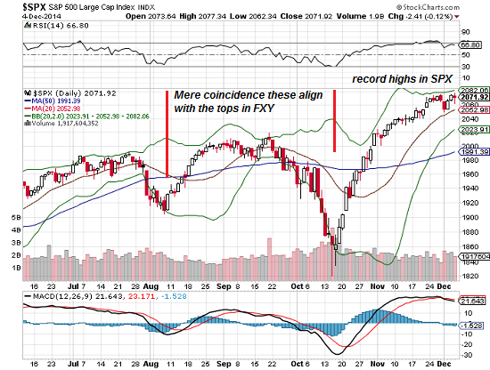
Here is the S&P 500, with red lines marking its recent lows:

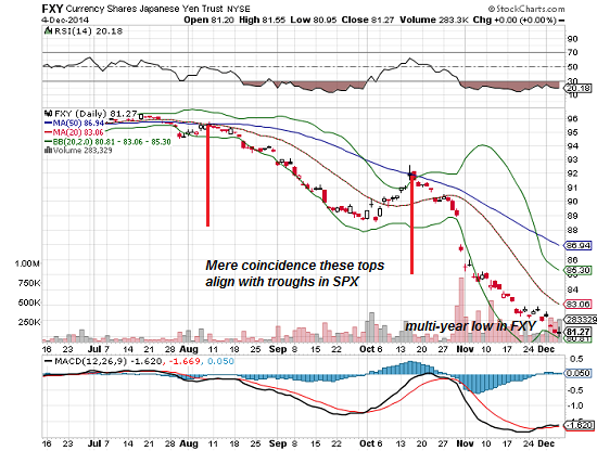
Here is the Japanese yen ETF FXY, with red lines marking its recent highs. The correlation is near-perfect: when the yen drops, the SPX rises.

This is a function of the carry trade, in which speculators borrow money in near-zero interest-rate yen and buy U.S. stocks with the cash. The financiers make money in two ways: the buying pushes the U.S. stocks up and the decline of the yen means they can pay back their loan in cheaper yen.
But the correlation isn't caused by just the carry trade: it's also a function of trading computers keying on the carry trade for momentum and direction.
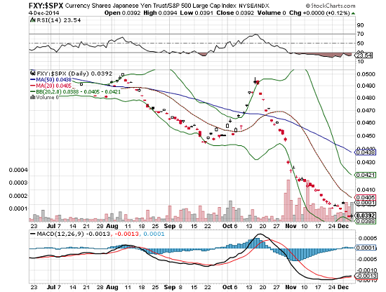
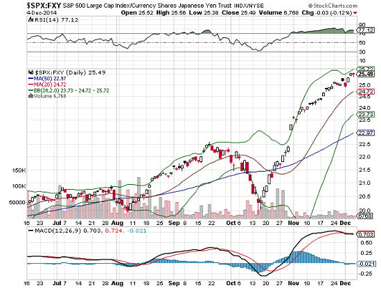
The correlation is also visible in two ratio charts: SPX-FXY, and FXY-SPX:


As long as corporations continue borrowing money to buy back their own stocks and the yen keeps dropping, the SPX will continue lofting higher. If either of these drivers fades or reverses, the rally in SPX will reverse, too.
Sourced From Charles Hugh-Smith of OfTwoMinds blog
No comments:
Post a Comment